
Paper cup printing happens on a flat blank that is then wrapped into a cone, so good artwork is designed for the cone, not the rectangle. Skip that step and the problems show up on the first formed sample: a logo that looked centred on screen sits half over the seam, a horizontal stripe smiles upwards, or the tagline along the top edge disappears into the rolled rim. This guide covers how custom printed paper cups are printed and how to set up artwork that survives forming.
Which printing method is used for paper cups?
Cups are printed flat before forming. Offset lithography is widely used for full-colour designs on cup blanks; flexography suits kraft cups, designs with a few solid colours and long repeat runs; digital printing suits short runs, trials and versioned designs. The best choice depends on the design, the board and the run.
| Method | How it works for cups | Best for | Limitations |
|---|---|---|---|
| Offset (sheet-fed) | Cupstock sheets printed, then blanks die-cut for forming | Photographic images, gradients, fine type, CMYK plus spot colours | Plate and make-ready costs favour mid to long runs; muted colour on kraft |
| Flexo (reel-fed) | Cupstock reels printed with flexible relief plates, then die-cut | Kraft cups, one to a few solid colours, repeat orders of simple designs | Plate cost per colour; fine detail, small reversed type and soft vignettes are harder |
| Digital | Print from file without plates, sheets or reels | Short runs, seasonal and regional versions, market tests | Higher unit cost at volume; ink system must suit food packaging use |
How cost and minimums change between these routes is covered in custom packaging cost drivers and what determines MOQ. For process principles across all packaging, see flexo vs offset vs gravure vs digital printing.
White vs kraft cupstock
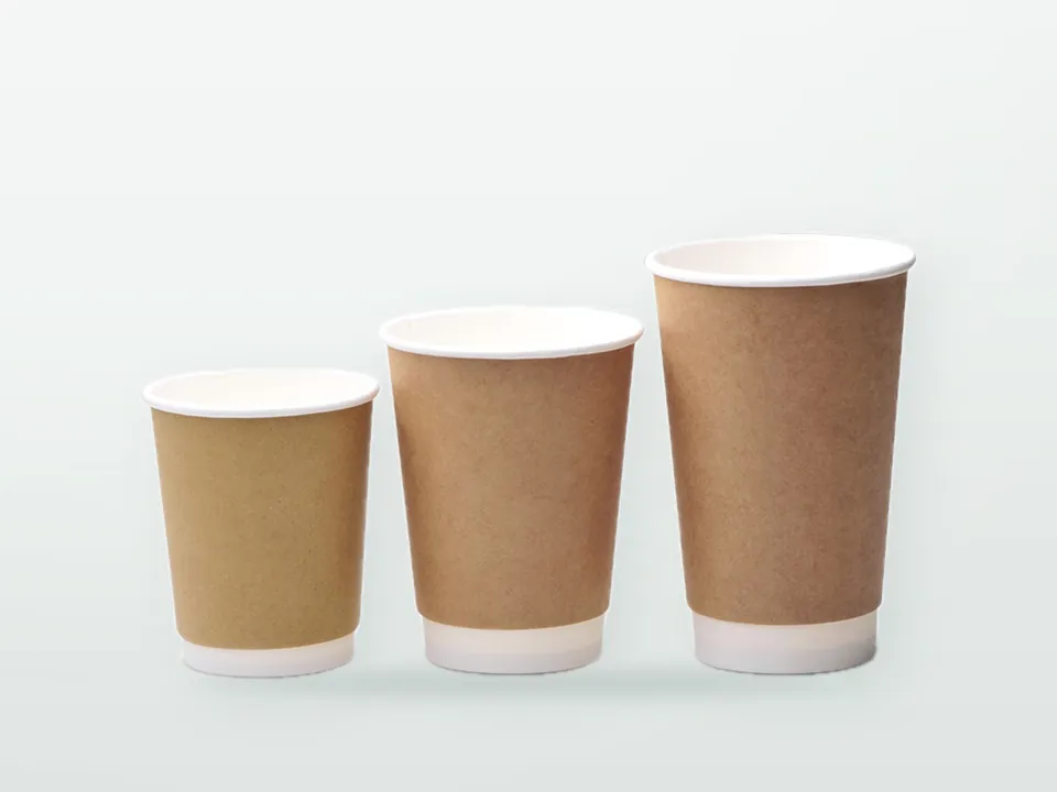
White cupstock reproduces colour as designed. Kraft cupstock is brown, so inks behave like a tinted overprint: light colours and pastels nearly vanish, yellows turn greenish, and CMYK images look dark. Designs for kraft cups work best with bold, dark or saturated spot colours, and with the board colour itself used as a design element. Printing an opaque white underlay is possible with some processes but adds cost and rarely matches a white board.
Printing on PE-coated surfaces
Hot cups are usually printed on the uncoated paper side. Cold cups with a barrier on both sides are printed on the coating, which needs inks formulated for that surface and suitable surface treatment for adhesion. Ask whether your design will print on paper or on a coating, because it affects colour and rub resistance.
Why is cup artwork fan-shaped?
A cup's sidewall is a truncated cone. When you unroll a cone onto a flat surface, it becomes a curved band: part of a ring, wider at the top than the bottom. That band, often called the fan, arc or annular sector template, is the shape of the printed blank.
The template comes from three cup dimensions: top diameter, bottom diameter and wall height along the slant. More taper gives a more strongly curved fan; a nearly straight-sided cup gives a flatter band. That is why every cup size needs its own template, even within one range, and why you should always work on the manufacturer's dieline for the exact cup rather than a generic template.
Key consequences:
- Horizontal lines on the cup are arcs on the template. A straight horizontal band drawn across the fan will look tilted or curved once formed.
- Vertical lines on the cup are radial lines on the template. They point towards the centre of the ring, so verticals at the left and right of the fan lean at different angles.
- The top edge of the fan is longer than the bottom edge, matching the larger top circumference of the cup.
How to avoid distortion on a tapered cup
Place each element along the arc and rotate it to its local vertical, rather than stretching the whole design to fit the fan. The unrolled cone is a true flat projection of the cup surface, so an element placed correctly on the fan appears undistorted on the cup.
The common mistake is to design on a rectangle and then apply an envelope warp to bend the whole artwork into the fan. That stretches the top of each element more than the bottom: circles become eggs, lettering widens towards the rim and logos look wrong. Better methods:
- Logos and icons: place at the required height on the arc and rotate so their vertical axis follows the radial line through their centre. Do not warp them.
- Lines of text: set on a path that follows the arc at that height, so text reads level on the cup.
- Horizontal bands and borders: draw as arcs concentric with the fan.
- All-over patterns: build the pattern on the fan geometry, or apply a gentle warp only to backgrounds and textures where distortion will not be noticed.
- Large wraparound illustrations: design on the fan from the start, or accept and check a controlled warp with a formed sample.
Keep in mind how people see a cup: from the side, in a hand, at a slight angle. Elements near the left and right edges of the fan meet at the back of the cup by the seam; the front panel, opposite the seam, is the hero area.
Seam overlap, rim curl and bottom curl: the no-print and no-detail zones
Three areas of the blank are hidden or deformed in the formed cup. Your manufacturer's dieline marks them for the exact cup; treat the descriptions below as what to look for, not as dimensions.
| Zone | What happens in forming | Artwork rule |
|---|---|---|
| Side seam overlap | One end of the blank overlaps the other and is heat-sealed, hiding a vertical strip | Keep logos, text and codes away; extend background colour through the overlap so no white line appears; avoid patterns that must match exactly across the seam |
| Rim curl (top) | The top edge is rolled outward to form the rim | Keep text and important graphics below the curl zone; colour can run into it as bleed |
| Bottom curl / knurl (base) | The bottom of the sidewall is folded inward around the bottom disc and pressed | Keep text and graphics above this zone; expect distortion in the lowest band |
| Bleed | Die-cutting has a positional tolerance | Extend background beyond the trim line as the dieline specifies |
Two further points matter at the rim. First, the rim is where the drinker's lips touch, so many specifications keep the rim curl area clear of ink or restrict what may be printed there; follow the manufacturer's guidance. Second, on double and ripple wall cups the printed outer wrap has its own seam, which can be positioned relative to the inner cup's seam; ask how they align if your design has a strict front panel.
Placing the SUP marking, barcodes and QR codes
Mandatory and functional elements need flat, visible, undistorted space, so plan them before the creative layout fills the fan.
- EU "Plastic in product" marking: required on plastic-lined cups in the EU under Implementing Regulation (EU) 2020/2151, in the language of each market, with design, size and placement rules set in the Regulation. Position it on the visible outer surface, clear of the seam, rim and bottom zones, and check it fits on the smallest cup in the range first. What the marking requires by market is in paper cup regulations in Europe and the UK.
- Barcodes: a linear barcode on a curved surface reads best when the bars run around the cup and the code reads from top to bottom (ladder orientation), so curvature does not bend the code. Keep it away from the seam and test-scan a formed sample.
- QR codes: keep them small relative to the cup diameter and at mid-height where curvature is least troublesome, with a clear quiet zone. Test with several phones on a formed cup, not on a flat proof.
- Legal and supplier text such as recycling instructions or batch codes: confirm whether the manufacturer adds codes in a reserved area.
Colour across cups, sleeves, lids and carriers
A cup range is printed on board that may differ from your sleeves, carriers and other packaging, and possibly with different processes. A brand colour specified only in CMYK will drift between substrates; a spot colour gives a better chance of consistency on white board, while kraft will always shift colour. Agree reference colours and tolerances, and approve physical proofs or printed samples rather than screen views. See Pantone vs CMYK in packaging.
Colour also changes with wall construction: a smooth double wall wrap prints like a single wall sidewall, while a ripple wrap breaks up fine detail and light tints. Construction choice is covered in single vs double vs ripple wall cups.
Inks and food safety on the outside of the cup
Inks sit on the outer wall, but cups are stacked and nested for shipping, so the printed outside of one cup rests against the food-contact inside of the next. Ink components can transfer by set-off in the stack. Good manufacturing practice under Regulation (EC) 2023/2006 requires that printing inks on the non-food-contact side do not transfer to the food-contact side in amounts that breach food law. In practice this means low-migration ink systems suited to food packaging, adequate drying or curing before stacking, and migration testing on the finished cup where required.
For German-market cups, the German Printing Ink Ordinance (part of the Bedarfsgegenständeverordnung) introduces a positive list for inks on food-contact materials, applying from 1 January 2027 after its transition period. Ask your supplier how ink compliance is documented. Wider food-contact requirements are in food-contact packaging compliance.
Proofing a cup design
Flat PDF proofs show the content but not the result. A sensible approval route is:
- Receive the manufacturer's dieline for each cup size, with seam, curl and bleed zones marked.
- Lay out the artwork on each dieline, with mandatory markings placed first.
- Review a 3D mock-up or a printed-and-wrapped paper proof to check orientation and seam position.
- Approve a colour proof against agreed references.
- Where the design or substrate is new, approve a formed pre-production sample before the run.
General file requirements (vector logos, outlined fonts, image resolution, colour profiles, bleed) are in the packaging artwork guide.
Artwork checklist for cup printing
- Dieline for each size from the cup manufacturer, not a generic template
- White or kraft board confirmed; paper or coated print surface confirmed
- Print method agreed and artwork prepared to suit it (spot colours for flexo, CMYK and spot for offset)
- Front panel opposite the seam; nothing important in the seam overlap
- Text and graphics clear of rim curl and bottom curl zones
- Text set on arcs; logos rotated, not warped
- SUP marking in each required language, placed and sized per the Regulation
- Barcodes in ladder orientation; QR codes tested on a formed sample
- Brand colours referenced; physical proof approval planned
- Language and market versions listed, with quantities per version
Send the checklist with your files via the custom printed paper cups hub, or contact 9 Packaging to request dielines for your sizes before your designer starts.