





Specify a brand colour as Pantone (a spot ink) when it must match exactly and stay stable from order to order; use CMYK when the design needs photographs, gradients or many colours. Most printed cartons and cups combine the two. The choice alone does not prevent the classic complaint, a brand red that looks right on a carton from one factory and slightly orange on a cup from another. That usually comes down to which substrate the colour was matched on and whether anyone agreed how close "close" has to be. This guide covers the Pantone vs CMYK decision, what brown kraft and other difficult materials do to colour, how Delta E tolerances work, and the proofs and approvals that keep colour consistent across reorders and suppliers.
What is the difference between Pantone and CMYK?
CMYK (process colour) builds every colour from small dots of four standard inks: cyan, magenta, yellow and black. Pantone colours are spot colours: each is a specific ink mixed to a published formula and printed as a solid. CMYK can reproduce photographs and many colours at once; spot colours give a more exact, more consistent match of a single brand colour.
The Pantone Matching System (PMS) is the most widely used spot colour reference in packaging, and designers usually specify colours from its Formula Guide. In German print specifications you will see spot colours called Sonderfarben or Volltonfarben. Each Pantone reference exists in coated (C) and uncoated (U) versions, because the same ink looks noticeably different on glossy and absorbent paper. Choosing "Pantone 185 C" for a matt kraft bag sets an expectation the paper cannot meet; the uncoated reference is the more honest guide.
| Factor | CMYK (process) | Pantone / spot colour |
|---|---|---|
| How colour is made | Halftone dots of 4 inks overlap | Pre-mixed ink printed solid |
| Range of colours | Limited gamut; many bright oranges, greens, blues and purples fall outside | Wide; includes colours CMYK cannot reach, plus metallics and fluorescents |
| Accuracy of a brand colour | Approximate; varies with dot gain and ink balance | High, when matched on the actual substrate |
| Consistency across runs | Sensitive to press balance | More stable, since one ink controls the colour |
| Photos and gradients | Yes | No (unless combined with CMYK) |
| Cost impact | Uses the press's standard 4 units | Each spot colour is an extra ink, plate and wash-up |
| Typical packaging use | Full-colour cartons, cups, labels | Logo colours on bags, wraps, napkins, corrugated; brand colours on cartons |
When should you choose Pantone over CMYK for packaging?
Use Pantone spot colours when a colour is central to brand recognition, when the design is mostly flat colour areas, or when the substrate makes CMYK unreliable (kraft, uncoated tissue, film). Use CMYK when the design includes photographs, many colours or gradients. Many cartons and cups combine both: CMYK for images plus one or two spot colours for the logo.
Practical rules:
- One to three flat brand colours on bags, wraps, napkins or post-printed corrugated: specify Pantone. Flexo jobs in these categories are commonly printed with spot inks only (see flexo vs offset vs gravure vs digital).
- Photographic or illustrative artwork on cartons or cups: CMYK, adding a spot colour if the brand colour sits outside the CMYK gamut or must match other packaging exactly.
- Very small text or fine lines in a brand colour: spot colour avoids the fringing that occurs when four halftone screens must align perfectly.
- Many SKUs that share a press run (several cup designs on one sheet, for example): CMYK keeps them combinable, whereas each extra spot colour adds a printing unit for the whole sheet.
Extended gamut printing (ECG)
Extended colour gamut printing adds fixed process inks, usually orange, green and violet (CMYK+OGV), to reach a much wider range of colours from a standard seven-colour ink set. Instead of mixing a new spot ink for each design, brand colours are simulated from the seven inks. The benefit is in combining many designs without ink changes, which suits flexible packaging and label converters running many SKUs. The limitation is that a simulated colour depends on tight press control; for a single critical brand colour, a true spot ink is still the safer specification. Ask your supplier whether a colour is to be printed as spot or built in CMYK or ECG, and what tolerance they will hold either way.
Why do colours look different on brown kraft?
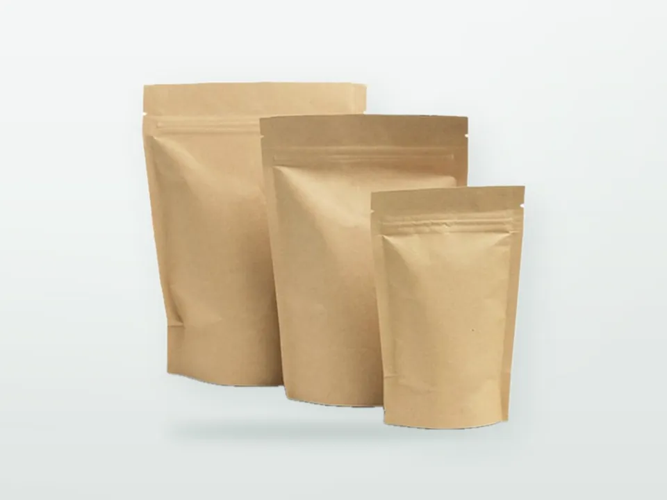
Printing inks are largely transparent, so on brown kraft the paper colour shows through and mixes with the ink. Light colours darken or disappear, yellows turn olive, blues shift towards green, and fine CMYK images lose contrast. A Pantone reference matched on white paper cannot be reproduced exactly on brown kraft.
There are three ways to handle it:
- Accept the shift and choose colours that work on kraft. Strong, dark colours (black, deep red, navy, dark green) hold well. Many brands deliberately use one or two dark spot colours on brown kraft for a natural look.
- Print a white underlay (white underprint) beneath colours that must look clean. This adds an ink station and cost, and on porous kraft a single white layer is rarely fully opaque, so the result is brighter but still not identical to white paper. How to set this up in artwork is covered in the packaging artwork guide.
- Switch to white kraft or white-lined board where colour accuracy matters more than the natural look. The trade-offs for bags are in brown kraft vs white kraft vs recycled paper.
Recycled and brown kraft also vary in shade between production batches, which means even a perfectly controlled ink can look slightly different from one delivery to the next. Agree with the supplier that colour is assessed against an approved printed sample on the same paper grade, not against a Pantone swatch on white paper. Similar logic applies to greaseproof and tissue: thin, absorbent papers spread ink and reduce saturation (see printing on greaseproof paper). Transparent film needs white underprint for any colour that should not look see-through.
| Substrate | What happens to colour | Typical approach |
|---|---|---|
| Coated white board (cartons, cups) | Closest to Pantone coated references | CMYK + spot; tight tolerances realistic |
| Uncoated white paper | Duller, more dot gain | Use uncoated (U) references; expect softer images |
| White kraft | Slightly warm, absorbent | Uncoated references; spot colours for logos |
| Brown kraft | Paper tone mixes with ink; light colours lost | Dark spot colours, or white underprint; match on kraft |
| Greaseproof and tissue | Ink spreads, saturation drops | Bold, simple designs; limited coverage |
| Clear or metallised film | Colours see-through without white | White underprint; reverse printing under laminate |
What is Delta E and what tolerance should you agree?
Delta E (ΔE) is a single number expressing how different two colours are, calculated from measurements taken with a spectrophotometer. The lower the number, the closer the match. For packaging, tolerances are not fixed by law; they are agreed between buyer and printer, often in the range of about 2 to 4 ΔE00 for spot colours depending on substrate and importance, with tighter values reserved for critical brand colours on coated board.
How it works: the instrument measures a colour in the CIELAB colour space, which describes it with three values (L* for lightness, a* for red-green, b* for yellow-blue). Delta E is the distance between the target and the sample in that space. The older ΔE76 formula is simple distance, but it does not match human vision well: equal numbers can look very different in blues versus yellows. CIEDE2000 (written ΔE00 or ΔE2000) adjusts the calculation for lightness, chroma and hue so that the same number corresponds more closely to the same visible difference across the colour range. When a supplier quotes a tolerance, always confirm which formula is meant, because a ΔE76 value and a ΔE00 value for the same pair of colours can differ substantially.
As a rough guide to perception, a difference of around 1 ΔE00 is close to the limit a trained eye can see under controlled lighting, around 2 is noticeable side by side, and differences above about 3 to 5 are usually visible to ordinary viewers. Treat these as orientation, not contractual values.
| Situation | Realistic tolerance (indicative, agreed per project) | Notes |
|---|---|---|
| Critical brand spot colour on coated board | Tighter end, around 2 ΔE00 or below | Requires a measured target and controlled press |
| Spot colour on uncoated white paper | Around 2-3 ΔE00 | Measured against an approved sample on the same paper |
| Spot colour on brown or recycled kraft | Wider, often 3-5 ΔE00 | Substrate shade variation dominates; visual approval common |
| CMYK solids and images | Defined via a print standard (e.g. ISO 12647 family) rather than one ΔE per colour | Grey balance and solids checked |
A good colour specification names the target (Pantone reference, or measured Lab values from an approved sample), the substrate, the formula (ΔE00), the tolerance, the measurement conditions and who measures. Measurement conditions matter because instruments can be set with or without UV light (ISO 13655 M0 to M3 modes), which changes readings on papers containing optical brighteners.
Proofs, drawdowns and press approval
Colour should be approved in steps that move closer to production: a soft proof on screen for layout, a contract proof for colour intent, an ink drawdown on the real substrate for spot colours, and a press check or printed pre-production sample for final sign-off (Druckfreigabe in German supplier correspondence).
- Soft proof (PDF): checks layout, text and position. Monitors are not reliable for colour unless calibrated and the substrate is simulated.
- Contract proof: a calibrated inkjet print made to a recognised standard (for example ISO 12647-7) that simulates a defined printing condition. Useful for CMYK work on white board; less meaningful for kraft or film.
- Ink drawdown: the printer mixes the spot ink and spreads a thin layer on the actual substrate using a hand proofer or a drawdown bar that approximates press ink film. This shows how a Pantone colour will really look on your kraft or greaseproof paper and is the best early check for spot colours.
- Press proof or press check: approval on the production press at the start of the run, either in person or via measured values and photographs. Expensive to attend, but definitive.
- Printed pre-production sample: a finished item made from production materials; see packaging sampling and quality control for how sample approval fits into the wider QC process.
View physical proofs under standard lighting. ISO 3664 defines D50 (approximately 5000 K) viewing conditions used by printers; colours checked under shop LEDs or daylight by a window can look different. Some colour pairs match under one light and differ under another (metamerism), which is why a light booth is used for approvals and why it helps to know where the packaging will be seen, such as a restaurant counter under warm light.
How do you keep colour consistent across reorders and suppliers?
Consistency depends on a fixed reference and measured targets. Keep an approved, signed physical master sample for every design and substrate, record the Lab values of each brand colour on that sample, and give those values, the tolerance and the formula to every supplier who prints the design.
Common reasons for drift between orders:
- A different paper batch or grade (especially recycled or brown kraft).
- A different print process (digital samples, flexo production; or offset cartons alongside flexo bags).
- Ink reformulated by the printer or sourced from a different ink maker.
- Approval against memory or a Pantone book instead of the last approved sample.
- Masters that faded: printed samples change with light exposure and age, so store references in the dark and renew them periodically.
For chains and franchises buying the same design from more than one supplier or plant, a brand colour standard document helps: the Pantone reference, the measured Lab target on each substrate used (white board, kraft, greaseproof, napkin tissue), the ΔE00 tolerance per substrate, and a note that substrate differences make cross-material matches approximate. A cup, a bag and a napkin will never be numerically identical, but they can be visually harmonised when targets are set per material. This is part of the wider standardisation work described in packaging for restaurant chains and franchises.
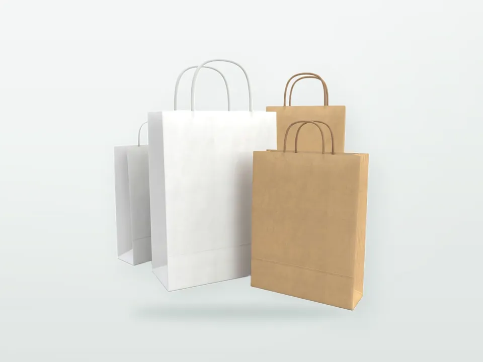
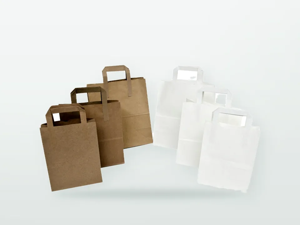
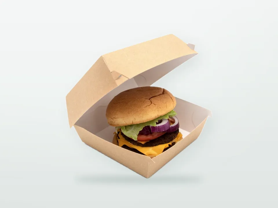
Product pages where colour decisions come up most: custom printed paper carrier bags (spot colours on kraft), custom printed burger boxes and custom printed folding cartons (CMYK plus spot on board), and custom printed paper cups (designs printed on cupstock sheets).
Colour specification checklist for your enquiry
Send this information with your artwork and you remove most colour disputes before they start:
- Each brand colour as a Pantone reference, stating coated or uncoated, and whether it should print as a spot ink or be built from CMYK or ECG.
- The substrate it will print on (white board, white kraft, brown kraft, greaseproof, film) and whether white underprint is acceptable.
- Any existing approved sample or Lab values from previous production.
- Your tolerance expectation, with formula (ΔE00), or a request for the supplier's recommendation for that substrate.
- The approval step you want: drawdown, contract proof, printed sample, press check.
- Who keeps the master sample and how reorders will be checked against it.
For file preparation, overprint settings and how to set up spot colours correctly in artwork, continue with the packaging artwork guide. 9 Packaging is an Istanbul-based manufacturer and exporter of printed packaging for business customers, with experience in chain foodservice packaging where colour consistency across many items matters. Colour targets and approval steps are agreed at quotation; send your brand colours and artwork through our contact page.