
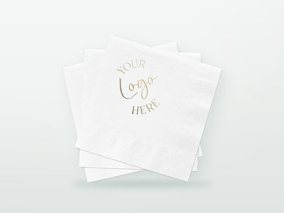


The logo that looks crisp on your cups and bags is often the wrong artwork for a napkin. Tissue is thin, soft and absorbent, so it takes ink in a way coated paper does not: lines thicken, small text closes up, colours soften and large solids look uneven. Printing on napkins gives good results when the artwork is simplified for tissue: bold shapes, heavier type, flat spot colours and moderate coverage. The sections below explain how napkins are printed, what reproduces well and how to prepare artwork that survives the process. For the wider specification of material, size and dispensing, start from the custom printed napkins hub.
How does printing on napkins work?
Most printed napkins are made by flexography with water-based inks on a napkin converting line, where printing, embossing, cutting and folding happen in one continuous pass. Short runs and stock-design napkins are sometimes printed digitally, but volume foodservice napkins are normally flexo.
On a typical line, wide rolls of tissue (one roll per ply) are unwound and brought together, the top ply passes through one or more flexo print units, the plies are bonded by embossing, and the web is cut and folded into finished napkins. Each print colour has its own flexible photopolymer plate (cliché), inked by an engraved anilox roller that meters a thin, even film of ink.
Why flexo with water-based inks: flexo copes with soft, stretchy, low-weight webs at speed; water-based inks dry quickly on absorbent tissue and avoid solvent odour on a product people hold to their mouths. The trade-off is resolution. Tissue cannot carry the fine screens used on coated board, and plates have to be made with that in mind. The general differences between print processes are covered in flexo vs offset vs gravure vs digital printing.
How many colours can be printed on a napkin?
Napkins are typically printed in one to four spot colours, depending on the converting line. One or two colours cover most foodservice logos; three or four allow multi-colour marks or patterns. Each extra colour adds a plate and set-up, so it affects cost and minimum quantity.
Practical guidance:
- One colour: the most reliable result, especially on 1-ply tissue. A single dark brand colour on white tissue reads clearly.
- Two colours: typical for logos with a mark and a wordmark in different colours, or a logo plus a simple pattern.
- Three to four colours: possible on many lines, but each colour must be well separated from the others because registration on tissue is loose (see below).
- Process colour (CMYK): photographic or full-colour images are generally not a good fit for flexo on tissue. Some short-run digital napkin printing handles full-colour designs, usually at much higher unit cost.
Spot colours are specified as Pantone references and mixed as inks. The printed result on tissue will look softer than the swatch; how far depends on the colour and the base tissue. Pantone vs CMYK in packaging explains colour matching in general.
What detail does tissue reproduce well, and what does it lose?
Tissue reproduces bold shapes, solid logos of moderate size, thick lines and simple repeating patterns well. It loses fine lines, small or light-weight text, thin outlines, tight gaps between elements, small reversed-out (white) text and smooth gradients.
| Element | On tissue | Why | What to do |
|---|---|---|---|
| Bold logo, solid shapes | Good | Simple edges tolerate ink spread | Use as the main element |
| Thin lines and hairline outlines | Poor | Ink spreads; lines thicken or break | Thicken lines or remove outlines |
| Small text, light fonts | Poor | Counters (the holes in letters) fill in | Use larger, heavier type or drop secondary text |
| Reversed-out text (white out of colour) | Poor at small sizes | Surrounding ink spreads into the gap | Keep reversed elements large and bold |
| Gradients, vignettes, photos | Poor to unusable on flexo | Coarse screens on tissue; tones band or jump | Replace with flat colour or a pattern |
| Large solid areas | Fair | Creped surface gives a mottled look; coverage limits apply | Reduce solid area; use pattern or coloured tissue |
| All-over repeating pattern | Good | Variation and registration shifts are hidden | Popular choice for tissue |
| Butting colours (two colours touching) | Risky | Registration movement creates gaps or overlaps | Separate colours with white space |
As indicative rules of thumb, many converters advise keeping lines no thinner than roughly 0.5 mm and text no smaller than roughly 8 pt in a bold weight, with larger minimums for reversed text and for 1-ply tissue. Exact limits depend on the line, the tissue and the plate, so ask for the converter's own artwork guidelines before finalising.
Why do colours look different on napkins?
Colours look softer on napkins because tissue absorbs ink unevenly, its creped surface scatters light, and the base sheet is rarely as bright as coated paper. Saturated dark colours survive best; pastels, light tints and yellows shift most.
The main causes:
- Dot gain and absorption: ink soaks into the fibres and spreads, so tints print darker and dirtier while solids print slightly weaker.
- Surface texture: crepe and embossing break up the ink film, making solids look grainy at close range.
- Base shade: recycled and unbleached tissues are greyer or browner than virgin tissue, which pulls every colour duller. See 1-ply, 2-ply, 3-ply and airlaid napkins compared for the material side.
- Show-through: on 1-ply and lighter 2-ply tissue, printed areas can be visible from the back, which changes how the napkin looks in a stack.
What helps:
- Choose the darkest acceptable version of the brand colour for tissue and record it as the napkin standard.
- Consider coloured tissue: a napkin dyed in the brand colour with a contrasting print often reads more on-brand than a large printed solid. White ink on dark tissue has limited opacity and is generally less effective than dark ink on light or mid-tone tissue.
- Judge colour on a printed tissue sample, not on screen or on a proof printed on paper.
Is there a limit on ink coverage?
Yes. Most converters limit how much of a napkin can be covered with solid ink, because heavy coverage stiffens the tissue, reduces absorbency, can cause ink to transfer between napkins in a stack and increases the risk of colour rubbing off on damp hands or food.
The exact limit varies by converter, ink system and tissue, and it is usually expressed as a maximum share of the surface or a guideline for solids. In practice:
- A logo in one corner panel is well within any limit.
- Repeating patterns with plenty of white space are normally fine.
- Designs that flood most of the napkin with solid colour are where problems start; a coloured base tissue is often the better route.
Colour fastness matters more on napkins than on most packaging, because they are used with wet hands, drinks and sauces. If your organisation requires it, ask what colour-fastness information is available for the printed napkin. Food-contact documentation for tissue and inks is outlined on the custom printed napkins hub and in the food-contact packaging compliance guide.
Where should the logo sit relative to the fold?
The logo must be placed on the panel of the unfolded sheet that ends up facing out after folding: one corner quarter for a 1/4 fold, a narrow strip for a 1/8 fold. Allow a generous margin from fold lines and edges, because the position of print relative to the fold moves by a few millimetres during a run.
Layout rules:
- Always supply artwork on the unfolded template with fold lines marked, and confirm which panel is the visible face.
- Keep the logo clear of the fold lines and the edge emboss band. Print that runs into a fold or emboss is distorted.
- Centre the logo within its panel with room to move, rather than tight to an edge. A logo designed to sit exactly 5 mm from the edge will not do so consistently.
- For 1/8 fold napkins, orient the logo along the length of the visible strip and reduce its size.
- For dispenser napkins, only part of the napkin is visible as it is pulled. Logo placement must suit the dispenser; see dispenser napkins for quick-service restaurants.
- All-over patterns avoid most position problems, which is one reason they are common on tissue.
Fold dimensions for each size are in napkin sizes and folds.
How does embossing work on napkins?
Embossing presses a raised pattern into the tissue with engraved steel rollers. On napkins it bonds the plies and adds bulk, and it can also carry branding: a decorative pattern, a border, or a blind logo with no ink at all.
Common emboss options:
- Edge emboss: a patterned band around the border that holds the plies together; standard on many 2-ply and 3-ply napkins.
- All-over emboss: a pattern across the whole napkin for bulk and texture.
- Deco or logo emboss: a specific motif, sometimes a custom logo, embossed into one panel. Custom emboss rollers are a separate tooling cost and make sense mainly for large, repeat programmes.
- Print and emboss combined: some lines can align emboss with print for a premium effect. Not every line can do this, and alignment tolerance is looser than on board.
Interaction with print: embossing over printed areas distorts fine detail and can crack heavy ink films. Keep detailed print away from emboss zones unless the converter confirms the combination.
Does airlaid print better than tissue?
Yes. Airlaid has a denser, more opaque and more uniform surface than tissue, so it holds finer detail and stronger colours, with less show-through. It is the better choice when the printed logo is the main reason for the napkin, for example at events or in premium dining.
Airlaid still behaves like an absorbent nonwoven rather than coated paper, so fine text and photographs remain limited on flexo. Some suppliers offer hot-foil or other decorative finishes on airlaid for small runs; availability depends on the converter.
Napkin artwork checklist
- Vector artwork (AI, EPS or PDF with outlined text), not a raster screenshot
- Number of colours and Pantone references, with the darkest acceptable tissue version of each
- Artwork placed on the unfolded template with fold lines and visible panel marked
- Lines and text checked against the converter's minimums; outlines and small text simplified
- No gradients or photos for flexo; flat colours or patterns instead
- Coverage kept moderate; consider coloured tissue for strong colour
- Margin from folds, edges and emboss band
- Emboss preference (edge, all-over, logo)
- Base material: white virgin, recycled, unbleached, coloured tissue or airlaid
General file preparation is covered in the packaging artwork guide. Ask for a printed sample on the production tissue before approving a new design, and judge it next to your other branded items; the packaging quality control guide explains sample and pre-production approval. When the artwork is ready, send it with your material and size choices through the custom printed napkins hub for quotation, using the packaging RFQ guide as a checklist for the rest of the request.