




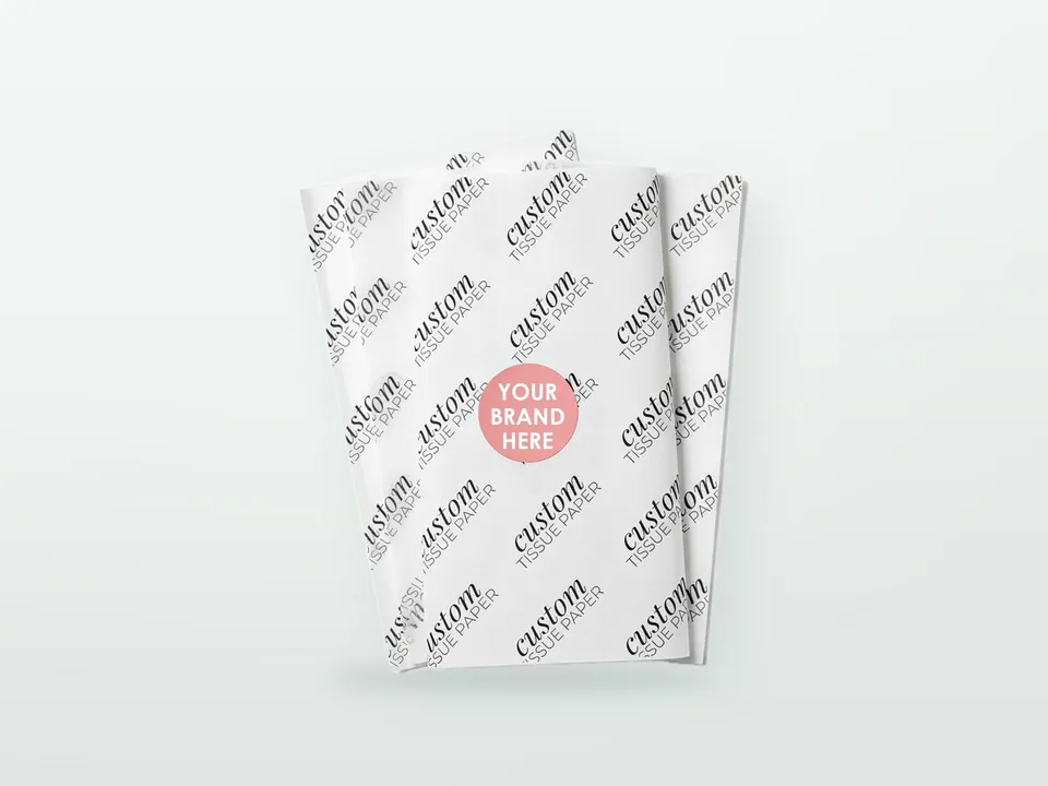

A logo that is crisp on a card box can look soft, pale or slightly bleary on tissue, and a dark pattern that looks good on the front can be visible from the back. This is not a sign of a bad printer. Tissue is thin, absorbent and light, so ink behaves differently on it, and the artwork has to be built for that: one or two colours, open repeats with moderate coverage, and colour-fastness tested before a run. The sections below cover how wrapping tissue is printed commercially, what each colour option achieves, how much coverage the paper tolerates and how to stop ink moving where it should not. Paper, sizes and ordering are on the custom printed tissue paper hub. Printing a few sheets at home on an inkjet or laser printer is a craft topic and is not covered here.
How is wrapping tissue printed?
Wrapping tissue is normally printed by flexography on a reel of paper, using water-based inks, and then cut into sheets or rewound into rolls. Flexo suits the long, thin, continuous web that tissue is and gives good colour at production speed.
In flexo, a flexible photopolymer plate carries the image, an anilox roller meters a thin film of ink on to it and the plate transfers the ink to the paper. Water-based inks dry quickly by absorption and evaporation, which is practical on a paper that soaks them up. Digital printing is used for very short runs of paper and card, but very light tissue is difficult to run digitally, so check with the printer whether it is available for your weight and run length. The general differences between processes are in flexo vs offset vs gravure vs digital printing, and colour matching is in Pantone vs CMYK. A lighter napkin tissue is printed on the same principle but with tighter limits; those are in printing logos on napkins.
How many colours can printing on tissue paper reproduce?
One and two colours are the dependable choices. Full colour (four-colour process) can be printed, but tissue blurs fine halftone dots and makes tight registration harder, so results are softer than on coated paper.
| Option | Strengths | Limits on tissue |
|---|---|---|
| 1-colour | Most economical, sharp solid-looking logo or repeat; easy to match to a Pantone reference | Large solids can wrinkle or show uneven density |
| 2-colour | Brand colour plus accent; two-tone patterns | Colours need a small gap or deliberate overlap; exact registration between colours is limited |
| Full colour (CMYK) | Illustrations, gradients, multi-colour patterns | Dot gain softens detail; light tints and fine text drift; photographs look flat |
| Spot colours (Pantone) | Brand colour accuracy | Light tints and pastels still print lighter and less even than on coated paper |
Choose a full-colour print only when the artwork is bold and made for it: simple illustrations, large shapes, patterns with some tolerance. If the design depends on detailed photographs or gradient skies, tissue is the wrong surface. For small text and fine lines, a minimum size is set by the printer; ask for it before designing. As a general principle in flexo on absorbent paper, avoid hairlines and very small reversed-out text, which close up as ink spreads.
How much ink coverage can tissue take?
Tissue prefers open, repeating designs with moderate coverage. Heavy solid areas add moisture and tension to a very light web, which can cause wrinkling, uneven density and drying problems, and the more ink that is applied, the more likely it is to show through.
Water in water-based ink swells paper fibres. A thin, light sheet reacts more than a heavy one, so a 17 gsm tissue with an all-over dark solid is the hardest case, and the same artwork on 25 gsm is easier. Large solid blocks may print with a visible mottle or edge-to-edge density variation, because the paper absorbs ink unevenly. Many brands solve this by choosing a coloured paper as the base and printing a lighter logo, or by using a pattern with lots of paper left showing. If solid coverage is essential, tell the printer early and test on the actual weight, because the paper, ink and plate set-up are chosen around it. The relation between weight and printing is also covered in tissue paper GSM and grades.
Why does ink show through, rub off or bleed?
Ink on tissue can show through to the back, rub off on the next sheet or the product, or bleed when the sheet is wet. Each has a different cause: thin paper, incomplete drying or setting, and dye or ink that is not colourfast.
| Problem | What it looks like | Typical cause | Mitigation |
|---|---|---|---|
| Show-through | Print visible from the back of the sheet | Thin paper; heavy ink laydown; dark colours | Higher gsm; lighter coverage; lighter colours |
| Set-off | Ink marks the back of the sheet above it in a stack or reel | Ink not fully set before rewinding or stacking | Slower speed, drying capacity, appropriate ink; ask how it is tested |
| Rub-off | Colour marks the hand, product or packing bench | Surface ink with weak anchorage; heavy solid | Rub test on the sample; choose ink system accordingly |
| Bleed when wet | Colour transfers to a damp white garment or skin | Water-soluble dye or ink | Colour-fastness spec; test against a damp white cloth |
| Offsetting in transit | Marks after humid transport or storage | Moisture and pressure in the carton or pallet | Humidity-aware packing; test aged samples |
Test with a damp white cloth, a rub test and a stacked sample left under weight for a day before approving a run. A wet-rub test matters most for dark colours and black tissue, which carry the most dye. For a product wrapped next to skin or white textiles, such as underwear, a bridal gown or a white shirt, specify colour-fastness explicitly rather than hoping the standard stock is fine.
What changes on coloured and black tissue?
On coloured or black stock, light inks and white have limited opacity, so a pale logo looks translucent and dark logos barely show. Printing on a coloured base works best with colours that contrast strongly with it, or with a darker ink on a lighter colour.
White ink on tissue is semi-transparent unless it is printed more than once, which adds ink and moisture to a light sheet. So a white logo on black tissue usually looks grey and soft, and a metallic-looking effect is generally not achieved with ordinary flexo inks. A cleaner route is a darker colour on a lighter base (a black logo on kraft, for example), a strong colour on a mid-tone, or a sheet dyed in the brand colour with the logo a shade lighter or darker. Black tissue itself is generally a dyed stock rather than a printed solid, and the quality of the dyeing matters more than the print. Request a sample of the actual stock and a print test with your logo. Recycling questions for coloured and black tissue are in is tissue paper recyclable.
Should you use an all-over repeat or a placed logo?
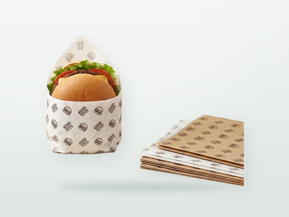
Use an all-over repeat when the sheet is cut after printing, because the repeat does not depend on where the cut falls. Use a placed logo only if you accept some variation in its position from sheet to sheet.
Tissue is printed on a wide reel and then cut, so the cutting position relative to the print varies within a tolerance. A repeating logo at modest spacing, a staggered (half-drop) layout or a simple pattern hides the shift. The distance between repeats is set by the print cylinder circumference, so the repeat size cannot be chosen freely; the printer will give the available repeat lengths. With a single placed logo, ask what registration the printer can hold between the print and the cut mark, and accept that the logo will sit slightly differently from sheet to sheet. Placed logos also work better on a size the packer always uses the same way up. The way a sheet is folded determines which part of the print the customer sees; see how to wrap products in tissue paper.
How should tissue artwork be prepared?
Supply vector artwork with fonts outlined and colours defined as Pantone or CMYK references, designed for the repeat or sheet size, with line weights and text sizes above the printer's minimums.
- Use vector files (PDF, AI, EPS) with text converted to outlines.
- Name the colours: Pantone references for brand colours, CMYK only for process work.
- Keep line weights and type above the printer's stated minimum; avoid hairlines and very small reversed-out text.
- Allow for dot gain: light tints and fine halftones print darker and softer than on screen.
- For repeats, supply the artwork at the repeat size and check it tiles without visible seams.
- State print on which side, and whether tissue is MF (matt both sides) or MG (glossy one side).
- Ask for a physical sample or press proof on the actual tissue before approval; a screen proof is not enough. The approval process is in packaging quality control, and file preparation in the packaging artwork guide.
Does print matter if tissue touches food?
Yes. If tissue touches food, the inks must be suitable for food contact, and the printed side should normally face away from the food. If it only wraps non-food items, the main ink question is colour-fastness.
For food wrapping, inks on the non-food-contact side must not transfer to the product through migration or set-off, and in the EU this sits under Regulation (EC) 1935/2004 and the good manufacturing practice Regulation (EC) 2023/2006; German buyers also look at the Printing Ink Ordinance, which applies from 1 January 2027. Ask the supplier for a declaration of compliance for the specific paper and ink, and see food-contact packaging compliance in the EU, UK and US. Printing on grease-resistant papers has its own rules, in printing on greaseproof paper. Plain tissue gives no grease barrier, so wrapping greasy food in it is a material choice problem before it is a print problem.
Printing on tissue paper: what to send for a quotation
Send the artwork, the paper (weight, grade, colour), the number of print colours with references, the preferred layout (repeat or placed), sheet size or roll width, and what will be wrapped. Mention special requirements, such as food contact or white garments, at the start.
Tell the printer which colours must match closely, what the tissue will touch and whether the print will be seen on both sides of an unwrapped sheet. A sample round on the real stock is normal for a new design. Request a quotation through the contact page, and see the parent hub custom printed tissue paper for the full specification checklist. The request format is in the packaging RFQ guide.