
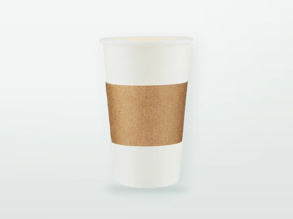

Good cup sleeve printing starts from the manufacturer's curved dieline, keeps logos and text off the glue seam and fold creases, matches the level of detail to the board (bold spot colours on kraft corrugated, finer work on smooth or white stock) and repeats the brand mark on both flat panels, because a sleeve can go on facing any direction. It is less forgiving than it looks: the design sits on a band that is glued, folded flat and slid onto cups of different heights, often on brown liner or textured board that will not hold the detail a screen shows. Sleeve campaigns also tend to arrive with a fixed launch date, so versions, proofs and lead time need planning from the start. This guide covers each of these steps in turn.
Sleeve materials, fit across a cup range and carriers are covered on the custom printed cup sleeves and carriers hub. Artwork for the cup itself is a separate job, set out in paper cup artwork on a tapered cup.
Why is a cup sleeve template curved?
Because the sleeve wraps a tapered cup, it is a slice of a cone (a cone frustum), and a cone frustum unrolls into a curved band rather than a rectangle. The flat sleeve template is therefore an arc, sometimes called a fan, wider along its top edge than its bottom.
The same geometry governs cup blanks, so the rules for placing text and logos on an arc without distortion carry over; they are explained in paper cup printing.
What differs for a sleeve:
- One template, several cups. A sleeve that fits 12, 16 and 20 oz cups is one dieline, so artwork is built once. It settles at a different height on each cup, so check that nothing important is designed to line up with a feature of a particular cup, such as a band on the cup print.
- The arc comes from the sleeve, not the cup. The manufacturer derives the sleeve's radius and height from the taper at grip height of the cups it must fit. A template made for someone else's cups may have a slightly different arc.
- The sleeve is flattened. A pre-glued sleeve arrives folded flat along two creases, so the printed band is seen as two panels in the carton and as one continuous ring on the cup. Both views matter.
Where should key elements go on a cup sleeve?
Keep logos, text and codes out of three areas: the glue overlap, the two fold creases and a small safe margin along the top and bottom cut edges. The best space is the middle of each flat panel, between the seam and the creases.
| Zone on the sleeve | What happens | Artwork rule |
|---|---|---|
| Glue overlap (side seam) | One end of the band is glued over the other, hiding a vertical strip; a glue strip on the underlying end is often kept free of ink and varnish so the adhesive bonds to bare board | Extend background colour into the visible part of the overlap so no gap shows; follow the dieline for the ink-free glue strip; no text, logos or codes here |
| Fold creases | The flattened sleeve is creased twice; on corrugated the flutes are crushed along the fold, and ink on dark solids can crack and show a pale line | Keep text and fine detail off the creases; avoid a large dark solid running exactly across a crease if the brand can tolerate a lighter background there |
| Top and bottom edges | Die-cutting varies slightly in position; on corrugated the cut edge can be slightly crushed | Keep text inside the safe zone the manufacturer specifies; carry background colour into the bleed |
Where the creases fall depends on the folding pattern. On many pre-glued sleeves one crease sits at or near the seam and the other directly opposite, which gives two flat panels of roughly equal width. Ask for the dieline with seam and crease positions marked rather than assuming.
Front panel, cup seam and which hand holds the drink
Unlike a cup, a sleeve has no fixed orientation in service. Staff squeeze it open and slide it on at whatever angle it lands, so the sleeve's front will not reliably line up with the cup's front panel, which sits opposite the cup's own side seam. Design as if the sleeve can face any direction.
Practical consequences:
- Repeat the main brand mark on both flat panels, roughly 180 degrees apart on the ring. Whichever way the sleeve goes on, and whether the customer holds the cup in the right or left hand, one logo faces outwards while the palm covers the other.
- Put a message that must be read, such as a campaign line or QR code, on one panel and the logo on both, rather than spreading one long line of text around the whole ring. Text running round the sleeve is read only by turning the cup.
- Keep the sleeve design from relying on the cup print behind it. Where both cup and sleeve are branded, the sleeve will cover part of the cup's grip zone in an unpredictable rotation; many chains keep the cup's mid-height band simple for this reason.
How does the substrate change cup sleeve printing?
The board decides what detail and colour the print can hold. Flexo on corrugated liner suits bold solids and simple logos; offset or flexo on embossed or pleated board gives cleaner colour but the texture breaks fine lines; digital print trades higher unit cost for no plates and easy versioning.
| Substrate and route | Holds well | Struggles with | Design approach |
|---|---|---|---|
| Flexo on brown kraft liner (corrugated sleeve) | Bold solids, dark and saturated colours, simple logos | Pastels and light tints, photographs, fine halftones, small reversed type | One to three spot colours; use the brown board as a design colour |
| Flexo on white liner (corrugated or micro-flute) | Brand solids, clean logos, moderate tints | Fine gradients, very small text, photographs at high detail | Spot colours for brand marks; keep tints and vignettes simple |
| Offset or flexo on embossed paperboard | Colour fidelity close to smooth board at a distance; full-colour designs | Thin lines, small text and QR codes across the emboss texture | Large shapes and type; ask for a smooth, unembossed area for small text or codes |
| Pleated or ribbed board, printed before forming | Repeating patterns, bold graphics | Detail and straight lines that cross the ribs | Test how the ribs bend lines; avoid fine type across ribs |
| Digital (board and some liners) | Short runs, many versions, full colour on white | Colour consistency on kraft; cost on long runs | Use for test markets, local versions and short campaigns |
How these processes compare across packaging in general, including plates, screens and make-ready, is in flexo vs offset vs gravure vs digital printing.
Printing on corrugated: liner colour and washboarding
On a single-face corrugated sleeve the print sits on the outer liner. Inks are largely transparent, so on brown kraft they behave like a tinted overprint: yellows go olive, light blues grey, and CMYK images look dark and flat. A white underprint brightens colours but is rarely fully opaque on porous kraft in one pass. If the brand palette depends on light or delicate colours, a white liner is usually the better choice than fighting the brown.
The flute structure matters too. If the liner is printed after it has been combined with the fluting (post-print), the plate presses harder on the flute tips than on the gaps between them, and fine detail and tints can show faint stripes following the flutes, an effect known as washboarding or fluting. It is most visible on E-flute and on light, even tints, and much less on finer flutes such as F or N. Printing the liner before it is laminated to the fluting (pre-print) largely avoids it. Which route your sleeve takes depends on the manufacturer's process and the run; ask, because it decides how much fine detail the design can carry.
Embossed and pleated board
Embossed board prints on a smoother surface than corrugated liner, but the emboss pattern is pressed into the board after or alongside printing, and its relief breaks up anything thin. Hairlines, small serif type and QR modules that fall across the raised and recessed texture can look broken or read poorly. Registered embossing, where the texture follows the design, is possible but adds tooling and set-up and generally makes sense only on larger runs. Asking for a smooth, unembossed panel for small text and codes is often simpler.
Colour matching between sleeve and cup
A sleeve on corrugated liner and a cup on coated cupstock will not match exactly, even with the same Pantone reference, because the substrates and often the processes differ. Approve the sleeve colour on its own substrate, judged next to a printed cup under shop lighting, and expect kraft to read darker and warmer; Pantone vs CMYK in packaging explains how to set targets and tolerances per substrate.
How small can text and lines be on a cup sleeve?
There is no single figure: the minimum depends on the process, the substrate and whether the text is positive or reversed out of a solid. Offset on smooth board holds the finest type; flexo on kraft corrugated, emboss and pleats need noticeably larger text and heavier lines. Ask the manufacturer for minimums for your exact sleeve and print route.
Indicative starting values for offset and flexo, with the reasons behind them, are in the packaging artwork guide. For sleeves, apply the more conservative end of those ranges whenever the board is brown, fluted or textured, avoid small reversed text altogether on kraft, and keep legal or campaign terms short enough to sit at a comfortable size on one panel.
Can a QR code on a cup sleeve be scanned reliably?
Yes, if it is large enough, dark on a light background, has a clear quiet zone, sits on a flat-reading part of the sleeve and has been tested on a made-up sleeve on a real cup. Codes that fail usually break one of these rules: too small, printed on brown kraft without a light panel, crossing an emboss or a crease, or crammed against other graphics.
- Size: phones need enough pixels per module. Around 2 cm across is a common starting point for close handheld scanning on smooth stock; go larger on corrugated or textured board. Shorter URLs give fewer, larger modules at the same printed size.
- Quiet zone: the QR specification calls for a clear margin of four modules on every side. Do not let background patterns or text intrude.
- Contrast: dark modules on a light background. On kraft, print the code on a white or very light panel, or use a white liner. Avoid inverted (light on dark) codes, which some scanning apps handle poorly.
- Curvature: at grip height the sleeve typically wraps a cup only about 70 to 90 mm across, so a wide code bends noticeably. Keep it compact, centred on a panel and well away from the seam and creases.
- Texture: keep codes off emboss and pleats, and on post-printed corrugated favour a larger module size so flute stripes do not break the pattern.
- Destination: point the code at a URL you control and can redirect, so a printed sleeve does not become a dead link when the campaign page changes.
Test with several phone models, under shop lighting, on a made-up sleeve fitted to a filled cup; a flat proof tells you little about how the code scans once curved.
How do you plan a sleeve campaign with several versions?
Decide the number of versions first, because it drives cost, minimums and timing more than the design does. The most economical structure is a shared base design with a variable panel, where only one colour changes between versions.
Shared base design plus a variable panel
Many campaigns need more than one sleeve: regional or language versions, several seasonal drinks, or a series of collectable designs. On plate-based processes (flexo and offset), every printing colour needs a plate, and every version that changes a colour needs a new plate for that colour plus its own press set-up. The way to keep versions affordable is to design for it:
| Campaign structure | Plates and set-up per extra version | Suits |
|---|---|---|
| Fully different designs in all colours | A full set of plates and a full make-ready for each version | Few, long-running versions with large quantities each |
| Shared base in all colours, variable panel in one colour (often black) | One new plate per version; base plates reused; shorter changeover | Language or region versions, drink names, local offers |
| All versions printed digitally | No plates; set-up mostly file handling | Many versions, short runs, test markets |
Splitting a quantity across versions lowers the run length of each, and each version normally has to meet its own minimum, so six versions is not the same order as one design in six times the quantity. Size each version from the share of hot drinks that actually get a sleeve, the number of outlets and the campaign length; the cup sleeve vs double wall cup comparison shows how to estimate that share. How print method and run configuration shape minimums and unit price is covered in minimum order quantities in custom packaging and packaging cost drivers; ask for quotations at two or three version counts so the trade-off is visible.
Lead time for seasonal launches
Plan backwards from the date the sleeves must be in every outlet, not from the launch date in the marketing plan. The chain of steps is: dieline confirmed, artwork final for all versions, proof rounds, colour proof or drawdown, made-up sample where the design or substrate is new, production, transit and distribution to outlets. Proof rounds and late copy changes across versions are where seasonal timelines usually slip. Typical ranges and how to build them into a calendar are in packaging lead times.
Which proofs should you approve before production?
A PDF proof, a colour proof on the real substrate and, for anything new, a made-up sample. A flat PDF proof checks content and position on the dieline; it does not show how the sleeve looks glued, folded and fitted. For any new design, substrate or campaign with a QR code, approve a made-up sample on your own cups before production.
A sensible approval route for sleeves:
- Lay out every version on the manufacturer's dieline (glue seam, creases, safe zone and bleed marked), with shared base and variable panel on separate layers.
- Approve the PDF proof for each version, checking spot colour names, plate count and the ink-free glue strip.
- Approve colour on the real substrate: a drawdown or printed proof on the kraft, white liner or embossed board you will use, viewed next to a printed cup.
- Check a made-up sample: glued, folded flat, opened and fitted to a filled cup of each size it serves. Look at the crease positions, the seam, how the logo faces in both hands and whether the QR code scans.
- Give written approval quoting the proof version for each sleeve version.
General proof types and approval practice are in the packaging artwork guide; how pre-production samples are used as the reference for later quality checks is in packaging sampling and quality control.
What to check before sending sleeve artwork
- Dieline for the approved sleeve, matching the cups it must fit, used at 1:1 and not redrawn
- Substrate confirmed: kraft or white liner, E-flute or a finer micro-flute such as F or N, embossed or pleated board
- Print route agreed (flexo, offset or digital) and artwork built for it: spot colours and solids for flexo on corrugated
- Nothing important in the glue overlap; ink-free glue strip respected; text and fine detail clear of both creases
- Brand mark repeated on both flat panels; campaign message and QR code on one panel, centred
- Text and line weights at or above the manufacturer's minimum for the substrate; no small reversed text on kraft
- QR code sized for the board, dark on light, four-module quiet zone, pointing to a redirectable URL
- Brand colours as Pantone references with tolerance; colour approval planned on the sleeve substrate
- Versions listed with quantity per version; shared base and variable panel on separate layers
- Date sleeves must be in outlets, so the timeline can be checked against proofs and production
- Made-up sample approval step agreed, including scan testing
For a coffee or café programme, sleeves usually sit alongside cups, carriers, pastry bags and napkins; see packaging for coffee shops and café chains. When your files and version plan are ready, send them with the cup details via the cup sleeves and carriers hub, or contact 9 Packaging about the sleeve dieline before your designer starts. 9 Packaging is an Istanbul-based manufacturer and exporter of printed packaging for business customers; substrate, print route and version structure are confirmed at quotation and technical review.